Advertising online has been a tricky business for awhile. Unlike traditional advertising, which can be slow to adapt, the Internet is always changing and attempting to find more ways to attract its core audience. Sometimes the shifts in tone will be so extreme that you will be shocked that they actually worked.
It definitely isn’t your grandpa’s marketing.
Color has a unique plan in advertising. In fact, it may be one of the most important elements to it.
Color and The Human Brain
All species have a reaction to color. Red may signify danger, green food, others help enhance movement or let prey ward off predators. As human beings, we come from the same evolutionary perspective. We also react to color, but on a much deeper scale.
Humans will connect on an emotional level with color schemes. Which is why it is so important to find the write one when branding. Advertisements, logos, promotional content, and designs are all impacted by the colors we choose.
When you select the right colors to match the tone of your ad, you will be able to improve results.
Display Advertising Color Tools
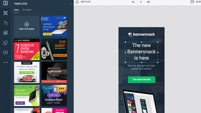
1. Bannersnack
Bannersnack is a comprehensive platform allowing you to design and monitor your display marketing creatives.
Not only will it let you create amazing banners but it will also allow you to manage your display advertising (Facebook, Adwords, etc) from one place.
You can create static, animated HTML5 and interactive banner ads using Bannersnack advanced visual editor.
2. Photocopa
This tool lets you generate color palette based on any picture you upload. This is a very useful tool when you want to match your banner to your logo or a social media branding:
3. Color Contrast Analyzer (Google Chrome)
This extension allows you to analyze color contrast on web pages. Unlike other color contrast analyzers, this one assesses text within images and reports how well your text overlay can be seen (especially to people with poor eyesight)
Using Color To Improve Your Brand Recognition
There are some colors that are immediately associated with a certain brand. Red and orange to match the clown mascot with McDonalds. Blue, orange and white for Walmart. Black, silver and gold for Chrysler. These are iconic.
In the case of your own brand, you may or may not reach those levels of recognition (every major corporation had to start somewhere). But you can at least lodge yourself into the brain of consumers by selecting the right colors for your brand.
Triggering Emotional Responses In Customers
Goal is important when choosing colors for ads. Of course you want conversions, so put that out of your head and assume it is a given. A better focus is triggering an emotional response that will make the customer want your product.
Your logo is going to be separate from this task. It will already feature on any banner ads, promotional materials, designs, commercials, etc., that you post on the web. And it doesn’t matter if it “clashes” with ad colors, because that will only make it stand out more.
That doesn’t mean you can’t match your ad and your logo. Just that it should be a secondary concern.
When choosing an ad, start by deciding what feeling to put off. Do you want your customers to think of your product as something that will put them at ease? That will pump them up? That will help them live a healthier lifestyle? That will make them more trendy? That will put them on the cutting edge? That will make them happy?
Try to think of two or three adjectives relevant to the focus of your ad. Then begin incorporating it into your advertising.
Red – As the boldest of the colors, red is a great attention grabber. But it is also aggressive. While customers will take notice, they may not respond in the way you want them to. Different tones of red, making it brighter or darker, may blunt that in-your-face feeling, and make it a bit more moldable to your brand. Unless the idea of your ad is to be extreme, in which case a bright red can really get the job done.
Green – Earthy and natural, green is a big promoter of health, wellness, wealth, and growth. It is perfect for any product or brand that centers itself around those concepts. Which is why it is the most commonly used color in natural supplements like vitamins and weight loss products. Anything that aims to promote forward motion and progress is perfect for green.
Blue – The most calm and tranquil of all of the colors, medical centers are especially apt at using blue for their services. It elicits emotions of trust, peace and serenity, like floating on a gentle ocean, or looking up at a clear sky. When put with other mild shades, such as white, it is further softened. But paired with darker shades, like black, it can take on a harder edge. Tech companies that need to show their machines as dependable are often seen using blue in their ads.
Yellow – Bright and bubbly, yellow is the happiest and most optimistic of all colors. That extends to its more passionate, playful cousin, orange. Both can give your advertisement a sense of importance and cheer that catches the customer’s attention, and makes them feel positive about the product.
Purple – Regal and rich, purple is the color that best promotes luxury and suave-cool. It is also a color used to represent intelligence and wisdom, appealing to customers as a symbol of the power of the mind. It is a highly sophisticated tone.
White and Black – Balance is an important part of advertising, and when using black and white you have to take care to strike that balance. In some instances both can be used to great effect, but too much of either can really damage your message. Think of both as enhancers, not straight themes. If you do need to do with a contrast, try grayscale instead. And make sure you are using it properly… these shades on their own, even in moderate gray, can come off as depressing to many customers.
Examples of Color In Advertising
Target
Target uses bright red to advertise based around a theme. Being a bullseye in their logo, the harsh combo of red and white work to give it a bold look that works for the brand.
Home Depot
Home Depot goes with an orange advertising theme, and it works well. It speaks of work and progression and optimism. Something that many people feel when undertaking home projects.
Milka
Purple is the color used by chocolate company Milka. It signifies the rich of their food product, and shows them off as a luxury brand.
Do you have an example of how color was used successfully in advertising or branding? Let us know in the comments! The post Color Theory in Display Advertising appeared first on SEO Chat.
Source: SEO Chat
Link: Color Theory in Display Advertising

Leave a Reply