During the past three years, desktop internet usage has declined from 90% to 60%, while mobile internet usage soared to 40%. If this trend continues, and it seems that it is likely to do so, mobile internet usage will soon surpass desktop internet usage. The general approach used by most designers when designing for mobile devices is to create a responsive smaller version of their desktop website. This approach, however, is not the ideal strategy for designing mobile sites. Instead of merely scaling down a website, it is best to assess the client’s business and how important mobile accessibility is for their users. The challenge for web designers nowadays is how they can design for various mobile devices which come in various different sizes. Here are a few best practices in creating better, more intuitive, and user friendly mobile user experience: Provide Clear and Concise Content
Mobile users are typically on the go. This, combined with relatively smaller screens, makes it necessary to feature web content that is easy to read. Minimalism is key, with each web page having just one central focus.
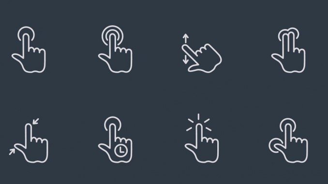
For atypical gestures, such as a swipe to go to the next page or a horizontal scroll, make it easy for users to use these features by adding a small arrow or a hovering message.
Keep Menus and Navigation Simple Unlike desktop websites with a menu bar at the top of their pages, mobile sites need something more compact to fit in the smaller screen. Instead of a menu bar, use a drop down accordion or icon on the top left or right of the mobile screen as your menu.
Refrain from having multi-level menus with sub menus that appear on hover and ensure that everything is accessible to mobile users.
Consider All Mobile Device Layouts
Image source: bradfrost.com
Always keep in mind that mobile devices come in several different dimensions. Don’t just design for a 320-pixel width, design for other sizes as well, like 176, 240, 320, 360, and 480 to 600 pixels for landscape.
You will need to make sure that your web layout is flexible and fluid so it displays properly on various screen sizes.
Focus on Touch Inputs and Gestures Today’s mobile devices no longer come with a keyboard and a mouse, and the primary mode of interaction is touch so you will need to design for touch.
In doing so, it is vital that you consider the different sizes, shapes, and pressures of fingers to mobile device touch screens and ensure that buttons, forms, and other elements that require touch input are large enough so there would be no overlap with adjacent elements.
Product management training instructors stress the importance of users in determining product design and the same applies to mobile web UX.
By keeping these things in mind as you design for mobile users, you are then able to provide a more efficient and positive experience to your mobile users which will also help your clients in building trust among their target audience.
The post Best Practices In Mobile UX Design appeared first on SEO Chat.
Source: SEO Chat
Link: Best Practices In Mobile UX Design

Leave a Reply