Google has confirmed that the search company is experimenting with a new Google Ads label display, this was after this has been spotted in the wild by some in the industry. The test includes different verbiage like “advertisement” and “sponsored” above mobile search ads, instead of just saying “Ads.” In many cases, the site’s favicon is featured directly to the left of the ad domain & display URL.
What it looks like. Here is a screenshot from Brodie Clark of a few variations:
Here’s an interesting test. Google is currently showing new ad label variations on mobile, now with the words ‘advertisement’ and ‘sponsored’. This is matched with another URL + favicon test from March – lots going on here. More info: https://t.co/j6IUtkSa1z pic.twitter.com/FLSnZcmzWc— Brodie Clark (@brodieseo) May 17, 2022
Courtesy of @brodieclark
Google confirmed. A Google spokesperson confirmed the test saying “This is part of a series of experiments to help users more easily identify the brand or advertiser associated with the Search ads they may see for a given query. We are always testing news ways to improve the experience for users on the search results page, but we don’t have anything specific to announce right now.”
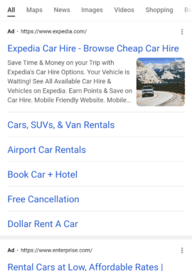
A more organic feel? Google has consistently evolved the visual display of ads over the past 15 years. Ads have graduated from a heavy blue background to today’s smaller bolded “Ad” text typically found to the left of the domain:
A current ad in the wild.
One can argue that this new test has ads taking yet another step towards replicating an organic result. In this view, the ad/sponsored/advertisement text is removed from the right side of the ad and moved above the site and domain. Replacing that label in some cases in now a favicon that is appearing to the left of the domain/display URL, much like a mobile organic result:
@rustybrick is this something new? “Sponsored”? pic.twitter.com/8jR3b7y8VH— Bastiir (@BastiirMatt) May 18, 2022
Image courtesy of Bastiir
The combination of the removal of the ‘ad’ notification horizontally next to the ad along with the favicon may well drive more clicks for those thinking they are clicking on an organic listing.
Why we care: If this experiment goes mainstream, both PPCers and SEOs could see a slight change in click-through rates. While the Google spokesperson isn’t wrong that users may more “easily identify the brand or advertiser associated with the Search ads” it is possible that they may less easily identify ads. With the Favicon on the left of the results, webmasters may notice increased CTR on ads, and less clicks on organic listings.
The post New mobile Google ad experiment puts favicon in-line with display URL appeared first on Search Engine Land.
Source: Search Engine Land
Link: New mobile Google ad experiment puts favicon in-line with display URL